
 |
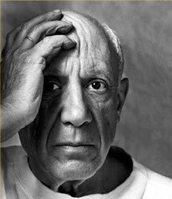
(Good Artists Copy; Great Artists Steal - Pablo Picasso) |
 |
| (Design is more then Brands ) |
Not only in commercial designing but even in art we
have forms that are closely associated with artist. Using ‘bindu’ is associated
with Raza, that it has become identity, Hussain’s play with ‘horse’ and
controversial paintings, Picasso’s geometrical figures, Mark Rothko’s style of ‘multi-form’ though simple rectangles
placed on top of one another, floating horizontally against a ground and et al.
Artists all over the world get inspiration from them and try to paint ‘like
them’ but ultimately land up painting ‘them’ i.e. imitating them. Why does this
happen?
All creations evoke and
express emotions. Emotions are the same everywhere. Still, the way emotions are
presented do vary according to style of a painter. What makes style unique? Why
is it difficult to be inspired by these artist and develop own style but
totally different from original? The only answer is - Simplicity of expression
makes these creations unique. Simplest concepts and things are hard to be
divided in fragments. It is complete and whole in itself.
 |
| (Bindu) |
New artist and designers should understand the
basic nature of design or painting. But copying seems to be trendy. There are many
reasons for it. Companies will do it out of ignorance or to be one of the best.
New artists may try it to confirm their presence and acceptance. Commercial
gains are higher if the set patterns are followed. But one should note that
‘inspiration’ is different from ‘imitation’. So to establish yourself, try to
be as simple as possible in expression even while expressing intricate. Let it
be close to common understanding and inferences. Take for example, ‘The Eden
Garden’ of Bible. It’s a Universal and everybody knows Adam and Eve. Since ages
visual is the same. Has anybody tried to change the style keeping the theme
intact? It will be almost difficult. It needs a passionate probe into what
makes this visual famous.
 |
| (‘The Eden Garden’) |
Apart from inspirational-imitation I have observed that there is exchange of artistic creation among various media. Even if the concept is presented as it is by another artist still the visuals have same weightage and fame. Speaking about this artistic exchange I would like to bring to notice the painting- book-multimedia and vice a versa or intermingling of all. They very famous in Indian art is the use of visually stunning image of a woman carrying lamp in darkness and the effect of light on the illuminated part of the face. The clearly visible trance and tranquility is unforgettable. This remarkable creation is of The Glow of Hope Painting by S. L. Haldankar.in painting form.
The same visual is used by film maker Guru Dutt in his classic black and white movie ‘Kaagaz ke Phool’ to bring out the emotions of a lonely women restless in love yet calm and serene. Both the painting and the motion media has same unforgettable image and yet devoid of ‘copy’ or ‘imitation’ tag. Also take the example of V. Shantaram’s Rajkamal studio logo in motion; it is clearly a modified concept of Raja Ravi Verma’s paintings having women beauty as his brand theme. And the best one is the RK studio logo. Raj Kapoor has a same visual presented in motion and static form. The logo actually is scene from the first successful movie under RK banner ‘Barsaat’ featuring Nargis, Raj and a violin.Next in the line is writing art into motion media- the books made into films; related to various genres of comedy, family drama, thriller, mystery etc, There are many Hollywood and Bollywood examples and the list is never ending. So, take the case of R. K. Narayan’s book ‘Guide’ and evergreen movie made by evergreen Dev Anand. Gulzar’s ‘Angoor’, based on Shakespeare’s drama ‘Comedy of Errors’ Chetan Bhagat’s ‘Three Idiots’ all these have become super hit stories in book form and in motion media.
As mentioned earlier the appealing concepts are simple and closely related to us. So this simplicity have to be tended and modified to look as an individual passionate creation. Inspiration can be sought outside the field of our interest. Observation is necessary to jot the artistic implications. Here again I would mention Raza’s use of ‘Bindu’; its is a common accessory used by Indian women to increase the beauty of face or it would be more romantic and beautiful if I put it in Indian language- ‘Shringarik Alankar’. A simple, inexpensive ‘bindi’ has gained fame and commercial benefits simply because it was used in artistic creation and symbolic representation.
 Development of original style to give a new look that appeal the senses of people are very difficult and one who does it becomes genius.
(A still and image- for illustrative purpose only / no copyright)
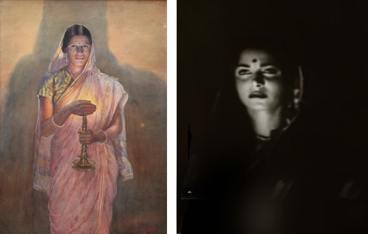 |
| ( The Glow of Hope Painting by S. L. Haldankar. and Still image from Kaagaz ke Phool) |
 |
| (The logo actually is scene from the first successful movie under RK banner ‘Barsaat’) |
As mentioned earlier the appealing concepts are simple and closely related to us. So this simplicity have to be tended and modified to look as an individual passionate creation. Inspiration can be sought outside the field of our interest. Observation is necessary to jot the artistic implications. Here again I would mention Raza’s use of ‘Bindu’; its is a common accessory used by Indian women to increase the beauty of face or it would be more romantic and beautiful if I put it in Indian language- ‘Shringarik Alankar’. A simple, inexpensive ‘bindi’ has gained fame and commercial benefits simply because it was used in artistic creation and symbolic representation.
- by Pankaja JK
(freelance art critic & writer)
(freelance art critic & writer)
(A still and image- for illustrative purpose only / no copyright)