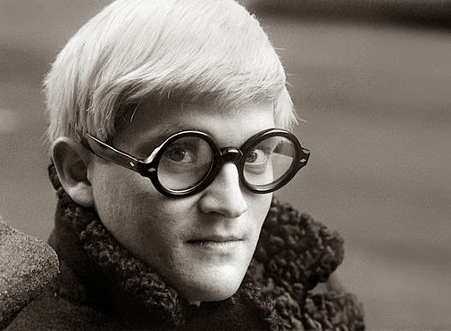
Monday 5 May 2014

Are Designers and Artists conditioned to be Inspired or Imitate?


(Good Artists Copy; Great Artists Steal - Pablo Picasso)

With the world becoming global village it is very natural that concepts and ideas get copied, plagiarized. But the basic question is, “What is it that appeals to senses and why are designers and artists inspired to copy or follow the original creation?” Consider the cases of Ray-Ban sun glasses, ambassador car or two-wheeler bullet. These brands are original and stand out among others in their category. Many designers have tried to follow the same designing pattern of Ray-Ban. But only original brand is in demand and fetch highest price.  Though there are en number of cars in market, Ambassador is still considered safe and enjoys VIP status. Simplicity and comfy style have made these things most sorted.


(Design is more then Brands )

Not only in commercial designing but even in art we have forms that are closely associated with artist. Using ‘bindu’ is associated with Raza, that it has become identity, Hussain’s play with ‘horse’ and controversial paintings, Picasso’s geometrical figures, Mark Rothko’s style of ‘multi-form’ though simple rectangles placed on top of one another, floating horizontally against a ground and et al. Artists all over the world get inspiration from them and try to paint ‘like them’ but ultimately land up painting ‘them’ i.e. imitating them. Why does this happen?  

All creations evoke and express emotions. Emotions are the same everywhere. Still, the way emotions are presented do vary according to style of a painter. What makes style unique? Why is it difficult to be inspired by these artist and develop own style but totally different from original? The only answer is - Simplicity of expression makes these creations unique. Simplest concepts and things are hard to be divided in fragments. It is complete and whole in itself.
(Bindu)
New artist and designers should understand the basic nature of design or painting. But copying seems to be trendy. There are many reasons for it. Companies will do it out of ignorance or to be one of the best. New artists may try it to confirm their presence and acceptance. Commercial gains are higher if the set patterns are followed. But one should note that ‘inspiration’ is different from ‘imitation’. So to establish yourself, try to be as simple as possible in expression even while expressing intricate. Let it be close to common understanding and inferences. Take for example, ‘The Eden Garden’ of Bible. It’s a Universal and everybody knows Adam and Eve. Since ages visual is the same. Has anybody tried to change the style keeping the theme intact? It will be almost difficult. It needs a passionate probe into what makes this visual famous. 

(‘The Eden Garden’)
Apart from inspirational-imitation I have observed that there is exchange of artistic creation among various media. Even if the concept is presented as it is by another artist still the visuals have same weightage and fame. Speaking about this artistic exchange I would like to bring to notice the painting- book-multimedia and vice a versa or intermingling of all. They very famous in Indian art is the use of visually stunning image of a woman carrying lamp in darkness and the effect of light on the illuminated part of the face. The clearly visible trance and tranquility is unforgettable. This remarkable creation is of The Glow of Hope Painting by S. L. Haldankar.in painting form.

( The Glow of Hope Painting by S. L. Haldankar. and Still image from Kaagaz ke Phool)


The same visual is used by film maker Guru Dutt in his classic black and white movie ‘Kaagaz ke Phool’ to bring out the emotions of a lonely women restless in love yet calm and serene. Both the painting and the motion media has same unforgettable image and yet devoid of ‘copy’ or ‘imitation’ tag. Also take the example of V. Shantaram’s Rajkamal studio logo in motion; it is clearly a modified concept of Raja Ravi Verma’s paintings having women beauty as his brand theme. And the best one is the RK studio logo. Raj Kapoor has a same visual presented in motion and static form. The logo actually is scene from the first successful movie under RK banner ‘Barsaat’ featuring Nargis, Raj and a violin.Next in the line is writing art into motion media- the books made into films; related to various genres of comedy, family drama, thriller, mystery etc, There are many Hollywood and  Bollywood examples and the list is never ending. So, take the case of R. K. Narayan’s book ‘Guide’ and evergreen movie made by evergreen Dev Anand. Gulzar’s ‘Angoor’, based on Shakespeare’s drama ‘Comedy of Errors’ Chetan Bhagat’s ‘Three Idiots’ all these have become super hit stories in book form and in motion media.
(The logo actually is scene from the first successful movie under RK banner ‘Barsaat’)


As mentioned earlier the appealing concepts are simple and closely related to us. So this simplicity have to be tended and modified to look as an individual passionate creation. Inspiration can be sought outside the field of our interest. Observation is necessary to jot the artistic implications. Here again I would mention Raza’s use of ‘Bindu’; its is a common accessory used by Indian women to increase the beauty of face or it would be more romantic and beautiful if I put it in Indian language- ‘Shringarik Alankar’. A simple, inexpensive ‘bindi’ has gained fame and commercial benefits simply because it was used in artistic creation and symbolic representation.


Development of original style to give a new look that appeal the senses of people are very difficult and one who does it becomes genius.   
   -  by Pankaja JK
(freelance art critic & writer)


(A still  and image- for illustrative purpose only / no copyright)

Friday 2 May 2014

David Hockney...Hockney was born in Bradford, England

( David Hockney)
Hockney was born in Bradford, England, on 9 July 1937 to Laura Beth and Kenneth Hockney (a conscientious objector in the First World War), the fourth of five children.[8] He was educated at Wellington Primary School, Bradford Grammar School, Bradford College of Art and the Royal College of Art in London, where he met R. B. Kitaj. While there, Hockney said he felt at home and took pride in his work. At the Royal College of Art, Hockney featured in the exhibition Young Contemporaries—alongside Peter Blake—that announced the arrival of British Pop art. He was associated with the movement, but his early works display expressionist elements, not dissimilar to some works by Francis Bacon. When the RCA said it would not let him graduate in 1962, Hockney drew the sketch The Diploma in protest. He had refused to write an essay required for the final examination, saying he should be assessed solely on his artworks. Recognising his talent and growing reputation, the RCA changed its regulations and awarded the diploma.


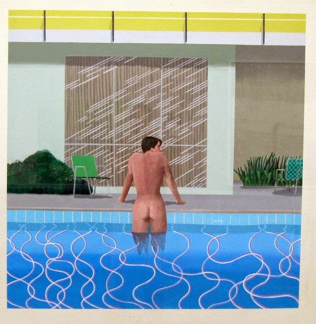
A visit to California, where he subsequently lived for many years, inspired him to make a series of paintings of swimming pools in the comparatively new acrylic medium rendered in a highly realistic style using vibrant colours. The artist moved to Los Angeles in 1964, returned to London in 1968, and from 1973 to 1975 lived in Paris. He moved to Los Angeles in 1978, at first renting the canyon house he lived in and later bought the property and expanded it to include his studio. He also owned a 1,643-square-foot beach house at 21039 Pacific Coast Highway in Malibu, which he sold in 1999 for around $1.5 million.


Hockney is openly gay, and unlike Andy Warhol, whom he befriended, he openly explored the nature of gay love in his portraiture. Sometimes, as in We Two Boys Together Clinging (1961), named after a poem by Walt Whitman, the works refer to his love for men. Already in 1963, he painted two men together in the painting Domestic Scene, Los Angeles, one showering while the other washes his back.In summer 1966, while teaching at UCLA he met Peter Schlesinger, an art student who posed for paintings and drawings.

On the morning of 18 March 2013, Hockney's 23-year-old assistant, Dominic Elliott, died as a result of drugs, drinking acid and alcohol at Hockney's Bridlington studio. Elliott was a first- and second-team player for Bridlington rugby club. It was reported that Hockney's partner drove Elliott to Scarborough General Hospital where he later died.

Work

Hockney made prints, portraits of friends, and stage designs for the Royal Court Theatre, Glyndebourne, La Scala and the Metropolitan Opera in New York City. Born with synesthesia, he sees synesthetic colours in response to musical stimuli. This does not show up in his painting or photography artwork, but is a common underlying principle in his designs for stage sets for ballet and opera—where he bases background colours and lighting on the colours he sees while listening to the piece's music.

Portraits
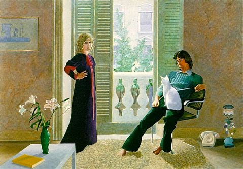
Mr and Mrs Clark and Percy (1970–71), Tate Gallery, London
 Hockney painted portraits at different periods in his career. From 1968, and for the next few years he painted friends, lovers, and relatives just under lifesize and in pictures that depicted good likenesses of his subjects. Hockney's own presence is often implied, since the lines of perspective converge to suggest the artist's point of view. Hockney has repeatedly returned to the same subjects - his parents, artist Mo McDermott (Mo McDermott, 1976), various writers he has known, fashion designers Celia Birtwell and Ossie Clark (Mr and Mrs Clark and Percy, 1970–71), curator Henry Geldzahler, art dealer Nicholas Wilder, George Lawson and his ballet dancer lover, Wayne Sleep.

On arrival in California, Hockney changed from oil to acrylic paint, applying it as smooth flat and brilliant colour. In 1965, the print workshop Gemini G.E.L. approached him to create a series of lithographs with a Los Angeles theme. Hockney responded by creating a ready-made art collection.

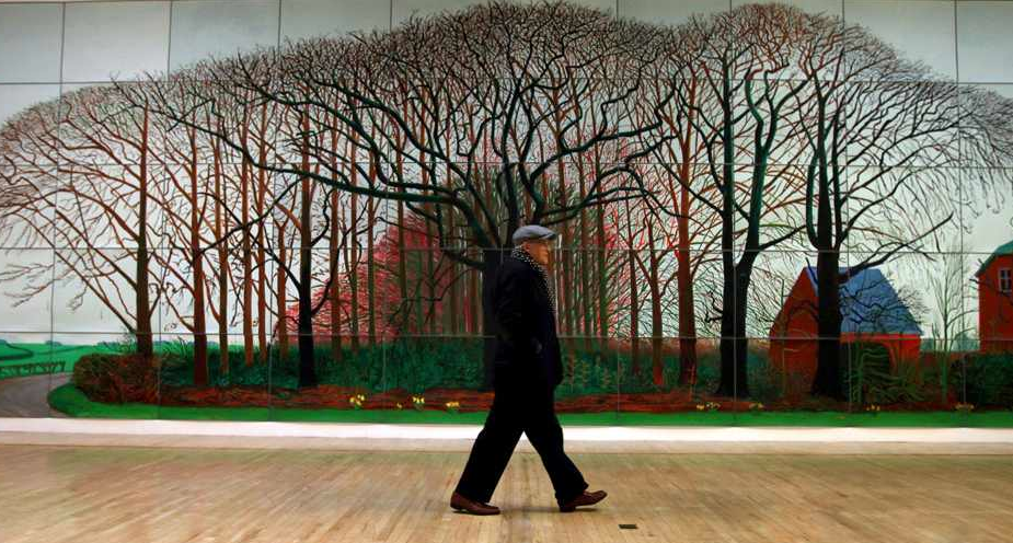
(David Hockney walking front of largest canvas then life)

(Source from Wikipedia, the free encyclopedia more read )